Fostering Entrepreneurship Through a Humanized Shopping Experience and Increased Efficiency of Social Commerce
My contributions and leadership in the research, design and launch of Lua 2.0: a native app that allows anyone to draw on social networks to start a successful online store.
Client: Lua
My roles: UX Designer, User Research
The Challenge
How often do you remember where and from whom you bought the t-shirt you're wearing or the kitchen utensils that you use to eat your meals? In the not-so-distant past, relationships formed between merchants and consumers advised buyers to make informed and personalized purchase decisions. These days, more and more of us live in big cities and frequent big box stores or online marketplaces for our shopping needs. The relationships between buyers and sellers-- and the benefits those relationships confer-- are increasingly rare.
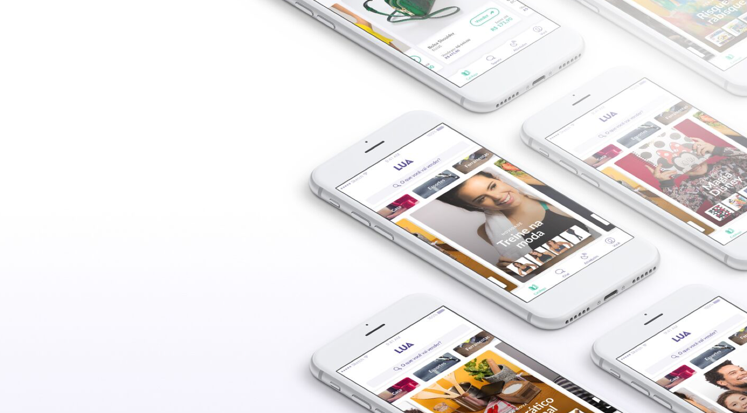
Lua is a social commerce platform founded in 2014 with the goal of helping independent merchants to sell items to their extended social network. Lua's initial proposition included managing logistics and shipping the products to the final buyer. Its primary users - the sellers - would promote various brands and products to members of their social networks and receive a commission for the sales. For this unusual supply chain to be successful, Lua's app needed to provide a straightforward and user-friendly experience. Joining the team in 2016 as Lua's UX designer, I took on the challenge of implementing a major design update to the mobile app, a new software built from scratch and internally named Lua 2.0.
The Outcome
Sharing the link of a product page or the seller's unique URL is the first step towards generating leads to a seller's online store. Prior to the launch of Lua 2.0, the average share of these links per user was less than one. We decided to use this metric as the main KPIs to evaluate the success of the new application. With the launch of Lua 2.0 version, the average content share per user was six to seven times better than its predecessor on the first week after the launch.
The precursor experience
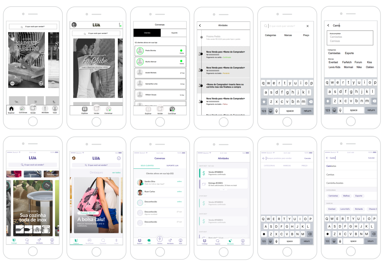
When I first came on board, it was clear that although sellers were downloading the 1.0 version of the app, most were not fully experiencing the main features. My team's initial goal was to understand the reason behind such low engagement.
Under my direction, we started two initiatives. The first one looked to the conversion funnel, then began investigating the reasons why sellers were not completing the app's basic tasks, such as sharing links of a product page or the seller's unique URL.
After locating the roadblocks over the interaction flows, we concluded that the sellers did not understand that they didn't have to themselves buy or own a product before selling and making a profit of it. There were so many steps before the act of sharing a link to a product page, that most of them gave up without grasping the app's core purpose of being a sales tool.
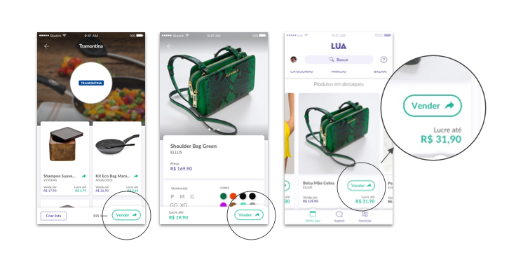
The "Vender" button was created to shorten the path to sharing and to inform the app core purpose
The first user research initiative
Our second initiative investigated how sellers were resolving their issues independently. To maximize the effectiveness of this research, I trained members of the customer care team to help do the contextual interviews. We visited six merchant entrepreneurs in their workplaces to listen to their stories and observe their methods of selling. Since the company's founding, this marked the first time independent sellers had been invited to share their stories. Why did they decide to start selling goods? How they attract and keep clients? Who are their most loyal clients? What were their ambitions? What challenges did they faced and how did they overcome them? Etc.
The final result of this collaborative work was an experience map that outlined the struggles independent sellers faced and in response to that, the new opportunities for Lua to fulfill its mission of fostering entrepreneurship.
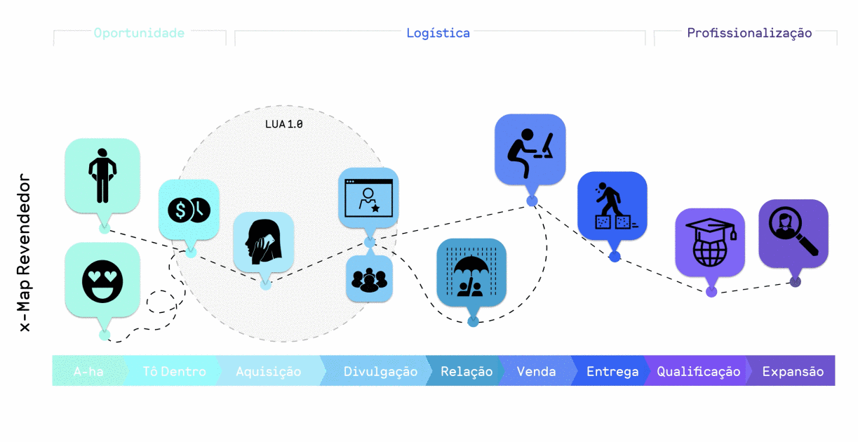
Combining the qualitative data from the experience map and the quantitative data of the 1.0 app's usage, I presented a design brief for version 2.0. The design brief offered a new direction, and illustrated where the team should direct its focus. The brief worked as a framework that I used to craft a roadmap of design sprints and to communicate with the development team and stakeholders.
Design Sprints
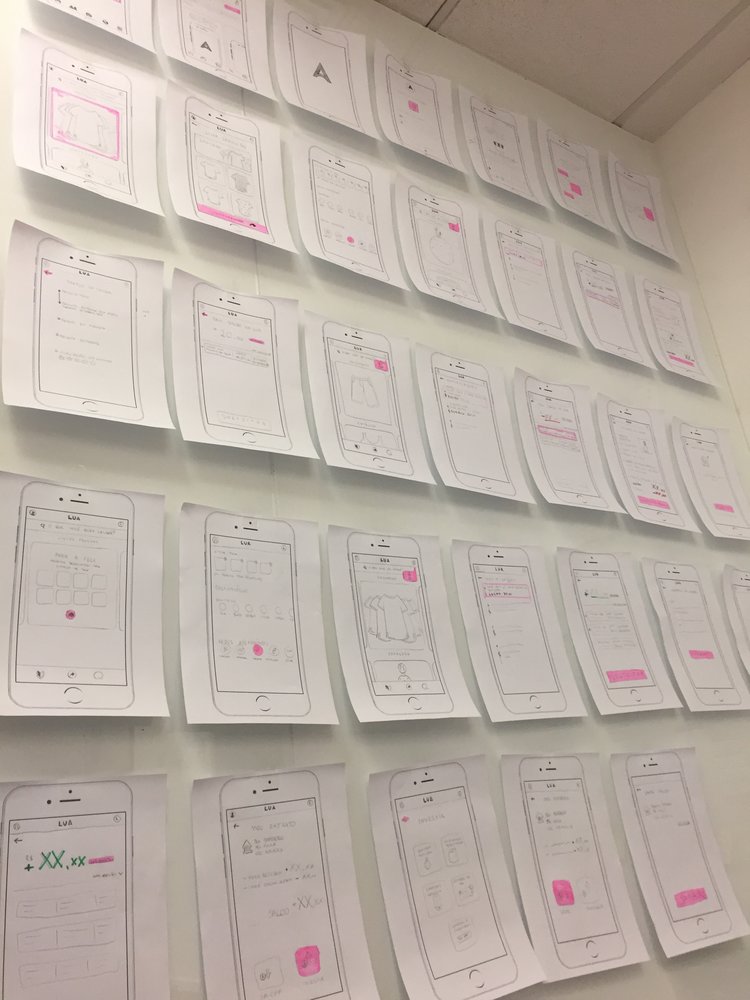
Following the agenda outlined in the brief, I started working on lo-fidelity prototypes of the app's most important screens in order to draft the navigation and make sense of the information architecture. Our team ran tests internally with other employees that helped identify gaps that had initially been overlooked and re-focused us on the most promising ideas that had surfaced throughout the research and design processes.
For some of the design sprints, I invited a more diverse group of people to work together from different areas of the company so we could discuss the possible solutions from different perspectives before deciding which one to prototype and test. Acting as a facilitator, I ran one to two week sprints mixing designers with developers and product and sales representatives. The directors of marketing, finance, and technology acted as experts, while the CEO had final say.
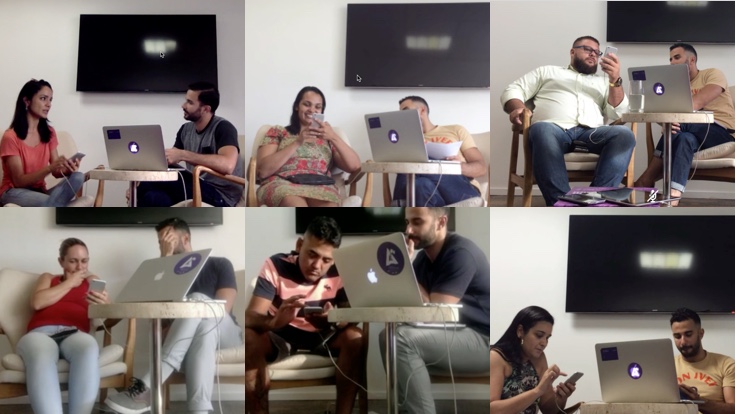
User Tests
As the design team worked on hi-fidelity screens, I ran scripted tests with external guests. During the tests, the guests had to perform specific tasks on our prototype. Once again, the personal stories that were uncovered in these interviews elucidated the challenges and uncertainties of our users. Other employees watched the tests in a second room, taking notes and marking comments. Every piece of this process informed our design decisions and strengthened the final negotiations with stakeholders.
The Final Product
During the final weeks of design, I managed a team of three designers in an intense work schedule to put all of the pieces together and deliver a full prototype and a PDF with the specs. Once the development team took over, I acted as the interim Product Owner, helping them to navigate the documentation around the user journeys, interactions, animations, and the overall architecture.
Hi-fi prototype: exploring different sections
Hi-fi prototype: onboarding
Takeaways
Empathy for the users is the main pillar of user-centric design, but if designers don't communicate effectively with stakeholders, all of the knowledge gained from the design process might never find its way into the users’ hands. I facilitated the ultimate success of version 2.0 via developing empathy for both the stakeholders and my colleagues and being resilient in my approach. I honed my ability to articulate design decisions for non-designers, I was open to others’ input about technical constraints, and I became extremely concise and instructive in my reports and when articulating the logic behind each proposed design. In the end, the various directors and the CEO developed trust in the design team, and they adopted a more user-backed decision-making process.
Lua 2.0 helped sellers to understand Lua's value proposition and engage with the application. Employees could finally watch active sellers performing for many consecutive months. It also shed light on new roadblocks, setting the stage for future updates. Key changes in future iterations of Lua business and applications (for example Lua 4.0, another project which I co-managed) were made possible by the new understandings that surfaced in the process of designing Lua 2.0.
© 2022 Edson Soares